Programming/python
[python] visualization pandas
그렉그의
2023. 6. 1. 13:48
import pandas as pd
import numpy as np
import matplotlib.pyplot as plt
In [37]:
#불러오기
df = pd.read_csv(f'/Users/grace/Desktop/Alex/Ice Cream Ratings.csv')
df
Out[37]:
DateFlavor RatingTexture RatingOverall Rating0123456
| 1/1/2022 | 0.223090 | 0.040220 | 0.600129 |
| 1/2/2022 | 0.635886 | 0.938476 | 0.106264 |
| 1/3/2022 | 0.442323 | 0.044154 | 0.598112 |
| 1/4/2022 | 0.389128 | 0.549676 | 0.489353 |
| 1/5/2022 | 0.386887 | 0.519439 | 0.988280 |
| 1/6/2022 | 0.877984 | 0.193588 | 0.832827 |
| 1/7/2022 | 0.140995 | 0.325110 | 0.105147 |
In [38]:
- 아래 그래프의 스타일을 정할 수 있음
#plt 스타일 중 classic 사용
print(plt.style.available)
plt.style.use('classic')
['Solarize_Light2', '_classic_test_patch', '_mpl-gallery', '_mpl-gallery-nogrid', 'bmh', 'classic', 'dark_background', 'fast', 'fivethirtyeight', 'ggplot', 'grayscale', 'seaborn', 'seaborn-bright', 'seaborn-colorblind', 'seaborn-dark', 'seaborn-dark-palette', 'seaborn-darkgrid', 'seaborn-deep', 'seaborn-muted', 'seaborn-notebook', 'seaborn-paper', 'seaborn-pastel', 'seaborn-poster', 'seaborn-talk', 'seaborn-ticks', 'seaborn-white', 'seaborn-whitegrid', 'tableau-colorblind10']
In [39]:
- bar chart
#plt 시작, kind/title/xlabel/ylabel 추가
df.plot(kind = 'line', xlabel = 'Daily Ratings', ylabel = 'Scores',title = 'Ice Cream Ratings')
Out[39]:
<AxesSubplot:title={'center':'Ice Cream Ratings'}, xlabel='Daily Ratings', ylabel='Scores'>
In [40]:
- Making stacked bar chart, specifying the column도 가능
df['컬럼 명'].plot.barh(stacked=True)
#barh , stacked 추가
df.plot.barh(stacked=True)
Out[40]:
<AxesSubplot:>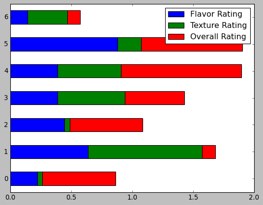
In [41]:
- scatter 는 꼭 x, y를 지정해줘야 함, s = size
#scatter tkdyd, x,y,color= yellow, size=500 설정
#scatter는 xlabel 이 아니라 x 로 써서 레이블링함
df.plot.scatter(x = 'Texture Rating', y = 'Overall Rating', s= 500,c= 'yellow')
Out[41]:
<AxesSubplot:xlabel='Texture Rating', ylabel='Overall Rating'>
In [42]:
- Histogram 만들기, bins = 아래 틱마크 명시
#histogram 만들기
df.plot.hist(bins=10)
Out[42]:
<AxesSubplot:ylabel='Frequency'>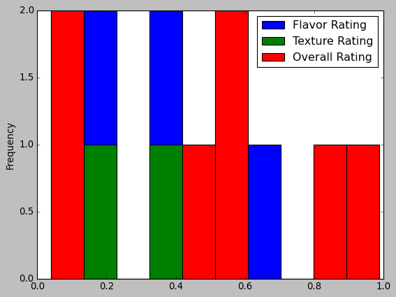
In [43]:
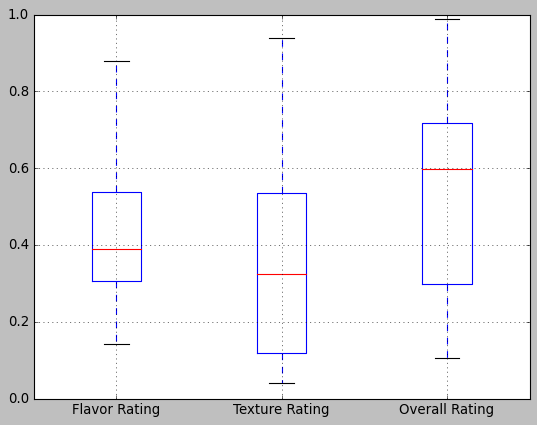
- low minimum, 25%, 50%, 75%, high maximum
#boxplot 사용
df.boxplot()
Out[43]:
<AxesSubplot:>
In [44]:
- figsize
#area 사용 , figsize = (10,5)
df.plot.area(figsize = (10,5))
Out[44]:
<AxesSubplot:>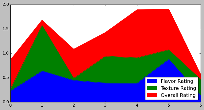
In [46]:
#pie 사용, y 레이블 및 figsize=(10,10)사용
#df.plot.pie(y = 'Flavor Rating', figsize =(10,10))
df.plot.pie(y='Flavor Rating',figsize=(10,10))
Out[46]:
<AxesSubplot:ylabel='Flavor Rating'>