08. 막대그래프 (기본)
In [1]:
import matplotlib.pyplot as pltimport matplotlibmatplotlib.rcParams['font.family'] = 'AppleGothic' matplotlib.rcParams['font.size'] = 15 #글자크기matplotlib.rcParams['axes.unicode_minus'] = False #한글폰트 사용시 마이너스 글자 깨짐 해결In [2]:
labels = ['강백호','서태웅','정대만'] #이름values= [190, 187, 184] #키plt.bar(labels, values)Out[2]:
<BarContainer object of 3 artists>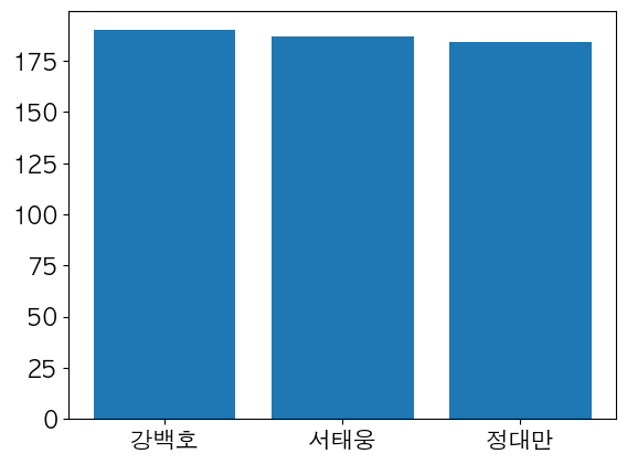
In [3]:
labels = ['강백호','서태웅','정대만'] #이름values= [190, 187, 184] #키plt.bar(labels, values, color = 'r')Out[3]:
<BarContainer object of 3 artists>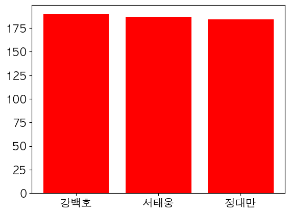
In [6]:
labels = ['강백호','서태웅','정대만'] #이름values= [190, 187, 184] #키colors = ['r','g','b']plt.bar(labels, values,color = colors, alpha = 0.5)Out[6]:
<BarContainer object of 3 artists>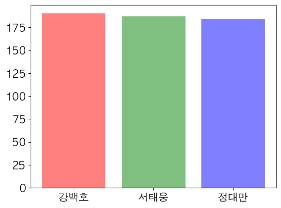
In [ ]:
labels = ['강백호','서태웅','정대만'] #이름values= [190, 187, 184] #키colors = ['r','g','b']plt.bar(labels, values,color = colors, alpha = 0.5)In [8]:
labels = ['강백호','서태웅','정대만'] #이름values= [190, 187, 184] #키#y축에 제약 두기plt.bar(labels, values)plt.ylim(175, 195)Out[8]:
(175.0, 195.0)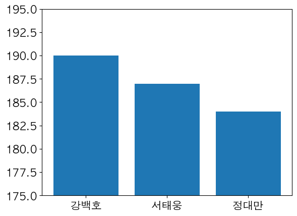
In [9]:
plt.bar(labels,values, width= 0.5)Out[9]:
<BarContainer object of 3 artists>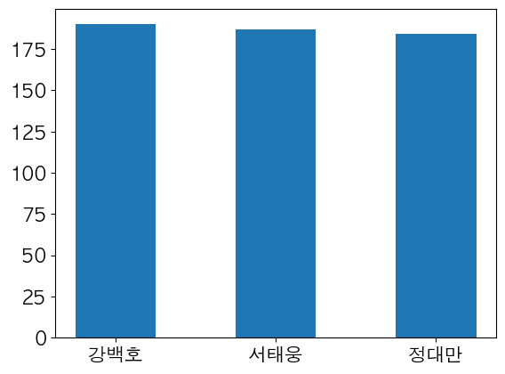
In [10]:
plt.bar(labels,values, width= 0.3)plt.xticks(rotation=45) # 이름 데이터 x 축을 45도로 설정plt.yticks(rotation=45) Out[10]:
(array([  0.,  25.,  50.,  75., 100., 125., 150., 175., 200.]),
 [Text(0, 0, ''),
  Text(0, 0, ''),
  Text(0, 0, ''),
  Text(0, 0, ''),
  Text(0, 0, ''),
  Text(0, 0, ''),
  Text(0, 0, ''),
  Text(0, 0, ''),
  Text(0, 0, '')])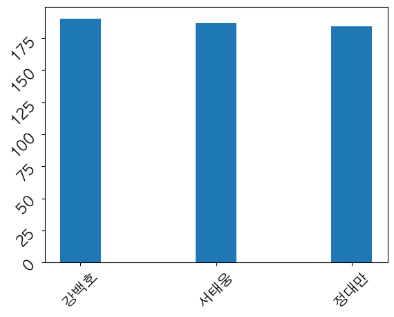
In [15]:
labels = ['강백호','서태웅','정대만'] #이름values= [190, 187, 184] #키ticks = ['1번학생','2번학생','3번학생']plt.bar(labels, values)plt.xticks(labels, ticks, rotation = 90)Out[15]:
([<matplotlib.axis.XTick at 0x7feab7b093d0>,
  <matplotlib.axis.XTick at 0x7feab7b093a0>,
  <matplotlib.axis.XTick at 0x7feab7b04a60>],
 [Text(0.0, 0, '1번학생'), Text(1.0, 0, '2번학생'), Text(2.0, 0, '3번학생')])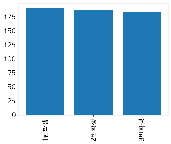
'Programming > python' 카테고리의 다른 글
| [matplotlib] Data Frame (0) | 2023.03.27 |
|---|---|
| [matplotlib] 막대 그래프(심화) (0) | 2023.03.27 |
| [matplotlib] 여러 데이터 (0) | 2023.03.27 |
| [matplotlib] 텍스트 넣기 (0) | 2023.03.27 |
| [Python] Pandas 데이터 확인 개념정리 (0) | 2023.03.23 |


